Intentional Typography
Observation
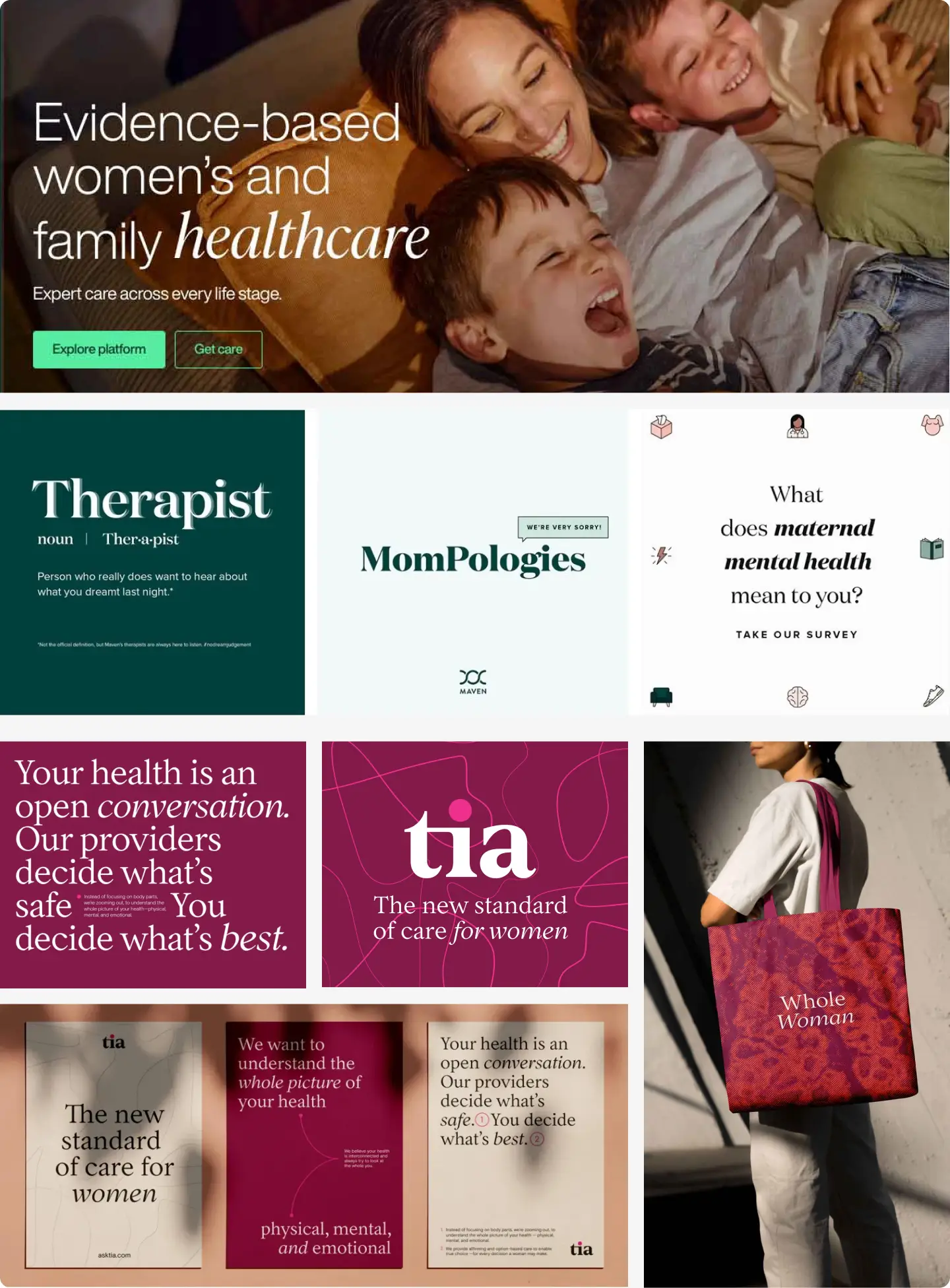
In looking at the use of typography, specifically within the Maven and Tia Health brands, what stood out to me was how intentionally they use type as a distinctive part of their identities rather than simply as a functional element.
Maven pairs expressive serif headlines with clean sans-serif body copy to balance warmth and clarity, while Tia’s primarily serif system creates a cohesive and highly recognizable visual voice.
Observation
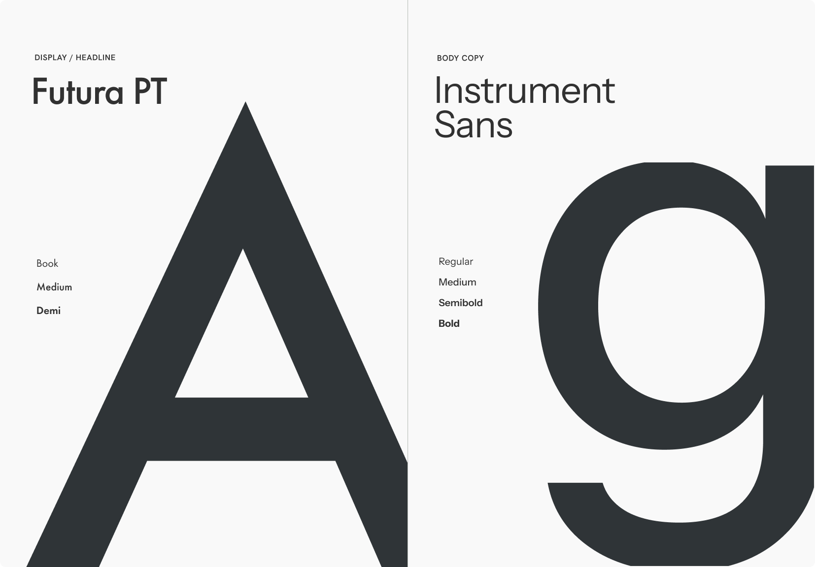
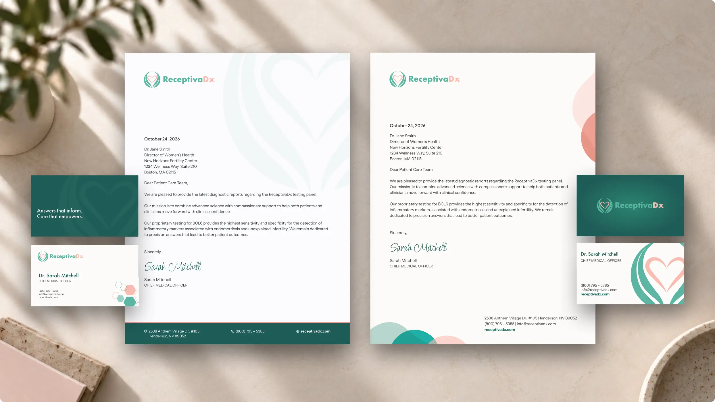
I saw an opportunity to build on ReceptivaDx’s established brand fonts, Futura and Avenir, while adding more variety to a typographic system that could sometimes feel too uniform. Stronger hierarchy, contrast and scale could improve legibility across applications. A more expressive serif accent font could introduce personality and flexibility without losing the familiarity of the existing typography.