
let's talk.
Get in touch with me
connect.
Find me on LinkedIn
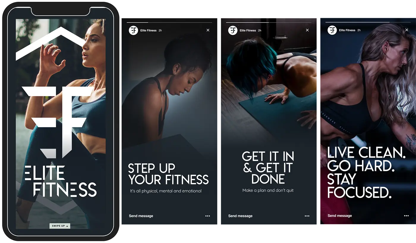
“Elite Fitness” (name changed due to NDA) is a wellness brand built on the idea that fitness is more than just training — it’s about physical, mental, and emotional balance. I was brought on to create a visual identity that captured this holistic mission while aligning with the client’s personal aesthetic.
The brand needed an identity that primarily appealed to women ages 24–44, while remaining inclusive for anyone pursuing a healthier lifestyle. Confidence, perseverance, and balance were central themes, with visuals focused on real people practicing lasting wellness. The challenge was to create a modern, approachable, and motivating identity that could stand out across digital channels—especially social media.
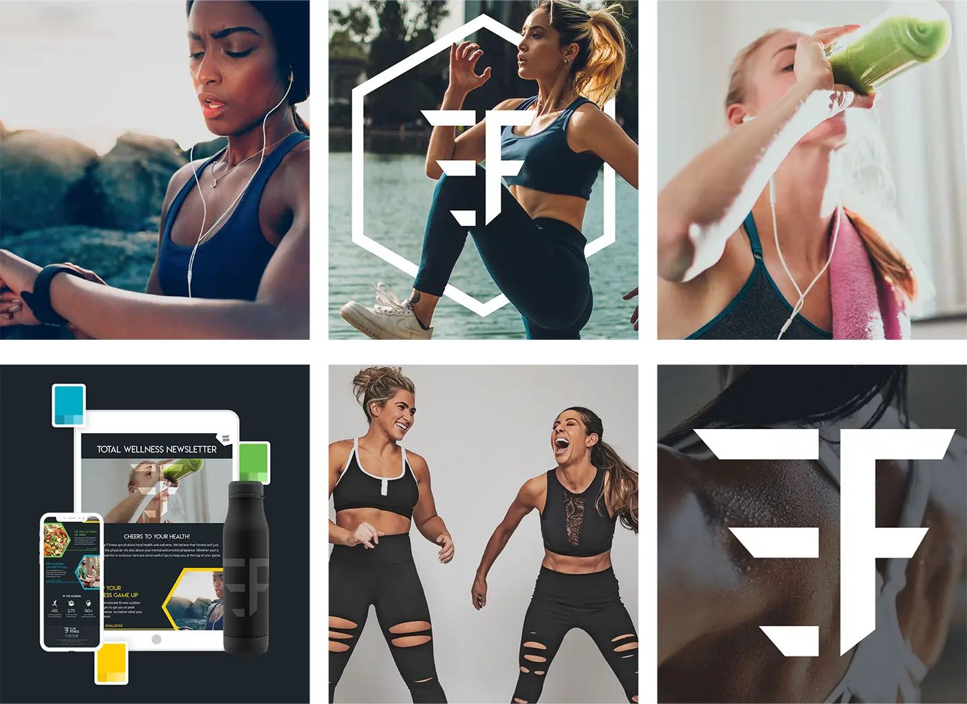
Because Instagram was the primary channel for growth, the creative was designed to resonate in a highly visual, engagement-driven platform. Bold typography and authentic imagery helped the brand stand out in crowded feeds while reinforcing empowerment, inclusivity, and a wellness-first mission

I designed a branded e-book to showcase Webalo’s expertise in the no-code space. Beyond reinforcing thought leadership, the e-book served as a valuable lead-generation tool, giving the sales and marketing teams a polished asset to nurture prospects.
To demonstrate real-world impact, I created branded applications including a gym mural, apparel, and custom equipment. These mockups helped the client visualize how the identity could extend into physical spaces and merchandise, reinforcing consistency and recognition across all brand touchpoints.


The identity paired Lemon Milk for bold, confident headlines with Quicksand for approachable, modern body copy. A high-contrast color palette was chosen to reflect strength and vitality, supported by lighter secondary tones that add balance and flexibility across marketing and wellness applications.


Black and white were chosen as the brand primary colors. At the two most extreme ends of the color spectrum, the combination evokes a feeling of confidence and strength. The secondary colors provide a bit of levity to the brand, enabling versatility in marketing channels, wellness products/services.

I extended the identity into branded merchandise and stationery, creating a system that worked for both corporate swag and lifestyle products. The designs were bold yet versatile, making them equally effective in promotional campaigns, retail, and community events.

To demonstrate real-world impact, I created branded applications including a gym mural, apparel, and custom equipment. These mockups helped the client visualize how the identity could extend into physical spaces and merchandise, reinforcing consistency and recognition across all brand touchpoints.


