
let's talk.
Get in touch with me
connect.
Find me on LinkedIn
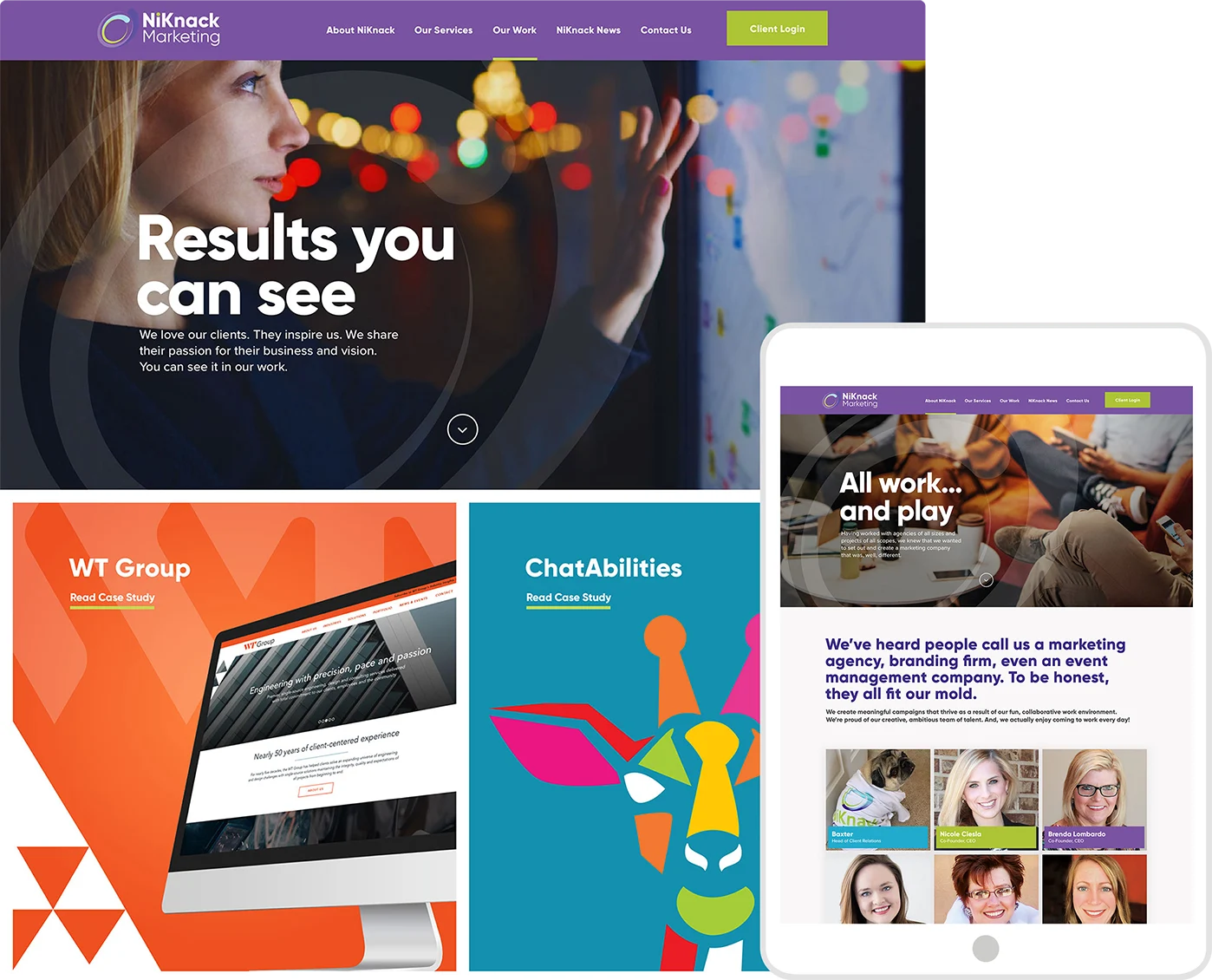
In 2018, I began a creative partnership with NiKnack Marketing, a full-service agency in Chicago’s Bucktown neighborhood. Led by two accomplished women CEOs, the agency delivers marketing, branding, and event management services to a diverse roster of clients. One of my first projects was to redesign their website, setting a new creative direction for the brand.
NiKnack’s previous site felt dated and fell short compared to competitor agencies. It wasn’t generating the volume or quality of inquiries needed to support the founders’ growth and acquisition goals. The redesign had to modernize the agency’s presence, elevate its credibility, and better convert visitors into new business opportunities.
Before wireframing, I presented a high-level creative vision that outlined how the site could look, feel, and function. The document broke concepts into clear categories and used best-in-class examples to broaden the client’s perspective and align on direction.


After the design strategy was approved, I created wireframes to organize the content and define the functionality of the components. Desktop and mobile wireframes were created simultaneously to ensure each component would be properly optimized for the respective device.

A vertical “snap scroll” was used on the homepage. As the visitor moves down the page, each screen snaps into the viewport, telling a compelling brand story as each section builds upon one another.
Prominent use of custom icons and data visualizations would be used throughout the page to not only support the text, but to make the content more visually appealing and easier to consume.
Each component would be designed to create a congruous and scalable design system that maintains brand consistency throughout the site experience and makes development more efficient.

While website form best practices recommend keeping forms short and simple (often relegated to one column and one page/screen), we opted to extend the contact form into three screens.
On the first screen, visitors select the reason for their inquiry. Using logical sequencing, we send users to the appropriate form (general inquiry, quote request or make an appointment).
This approach enables the agency to determine what percentage of the form users are just casually browsing, which are at the top of the acquisition funnel, and which are ready to convert.
The redesigned site brings NiKnack’s creativity and credibility to the forefront. With a distinctive, highly visual layout, clear data points, and a refined content structure, the site balances inspiration with usability. Interactive forms were strategically sequenced to help the agency qualify leads, giving the team a clearer picture of visitor intent while streamlining the path to conversion.
To align with the new site, I modernized the existing logo by removing dated gradients and introducing a bold sans-serif typeface. The result is a clean, contemporary mark that feels fresh while preserving the brand’s equity and recognizability.


