
let's talk.
Get in touch with me
connect.
Find me on LinkedIn
During some downtime, I explored a redesign of the iTunes desktop app to address long-standing usability issues. The concept modernizes the interface while retaining familiar elements, creating a cleaner, more intuitive experience for browsing and playback.
Although rebranded as Apple Music, the iTunes desktop app still feels dated and cluttered. Core tasks like browsing and managing media remain inefficient, with hidden navigation and overwhelming screens. I set out to reimagine the application to simplify the experience, reduce friction, and provide a more engaging entry point into the media library.


To move from concept to redesign, I broke the process into a series of clear steps—defining user needs, assessing usability, exploring solutions through wireframes, and finally bringing the interface to life with high-fidelity designs.
I established some user goals: the storing and playback of media (primary); browsing and discovering content (secondary)—any new enhancements would have to align with one of the two.
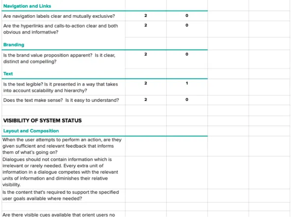
I conducted a quick usability assessment for some qualitative benchmarks. I found the screens to be complicated and restrictive; there were no new discoveries.
I created wireframes that introduced new features and enhancements to address the vulnerabilities that surfaced from the usability assessment.
Lastly, based on the wireframes, I applied visual design and created mockups of the new interface. I then used the mockups to create a prototype to visualize the UX.
The starting point of any application sets the tone for the entire experience. By rethinking the landing screen, I aimed to create clarity, orientation, and visual appeal right from the moment a user opens iTunes.

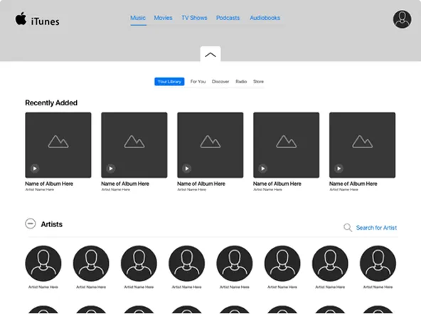
Upon opening iTunes, it’s unclear where to start—there are no onboarding instructions and the UI is not very engaging. Without clear entry points or visual cues, users are left to navigate on their own, which can feel disorienting and uninviting.
Now it’s clear what users can do here, there are obvious entry points to guide users and help them accomplish their goals/tasks. For added visual appeal, homescreens now include vivid background images and feature recently played/updated media content.
Efficient navigation is critical to a seamless user journey. My redesign ensures that switching between tasks is intuitive, fluid, and anchored in consistent visual cues.

Navigating the interface is taxing, and switching between screens is particularly challenging with the main navigation hidden inside a dropdown menu. This extra step interrupts the flow and simple tasks feel more cumbersome than they should.

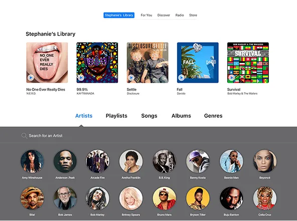
The main navigation has been pulled out of the dropdown and placed prominently at the top, making it easy to switch between screens. Supporting background imagery helps users stay oriented no matter where they are.
The media player is the heartbeat of iTunes, but its design lacked prominence. I restructured its placement and appearance so it feels both accessible and central to the listening experience.

Although anchored at the top, the media player tends to disappear into the window. With little visual contrast or emphasis, it fails to draw attention, making playback controls easy to miss and less central to the experience.

The player has been relocated to the bottom of the window, directly in the user’s line of sight and visible at all times. A darker color scheme creates stronger contrast, while polished controls give it a modern, more deliberate presence.
Playlists deserve more than being tucked away in a catchall menu. In this redesign, they’ve been elevated into a clear, accessible section that gives users faster access to their music.
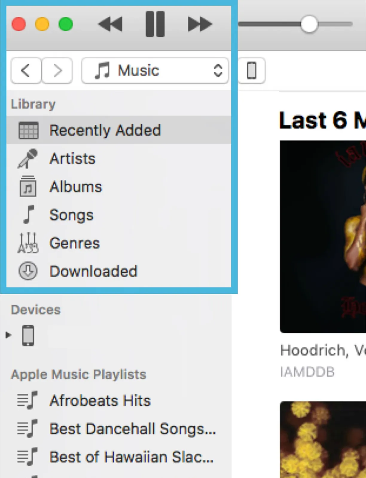
The left rail isn’t purposeful, appearing to be little more than a playlist catchall. Its lack of structure or hierarchy makes it feel secondary, offering little value.
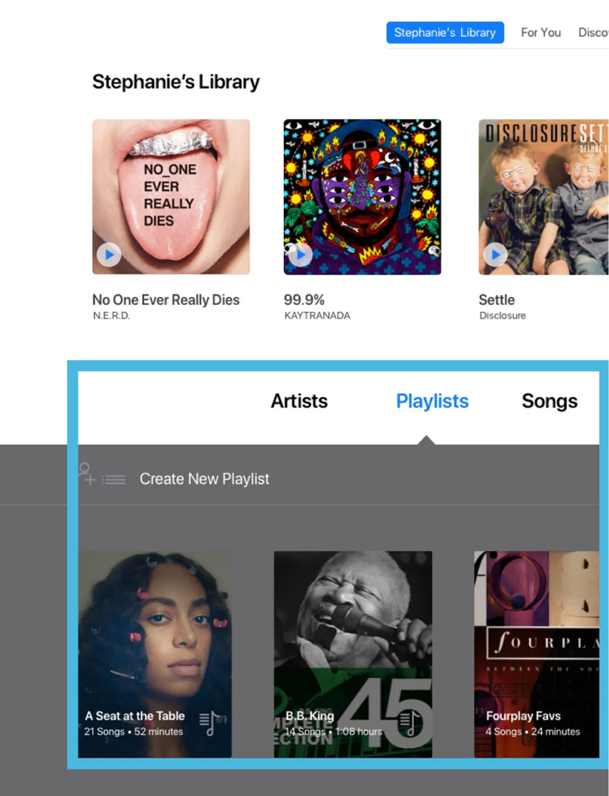
The left rail has been removed and the playlists have been given their own section in the library–they’re more prominent and easy to access.
Too much content can overwhelm users. By simplifying structure and highlighting what’s most relevant—new releases, trending tracks, and personalized recommendations—the store becomes a space for effortless discovery.

The excessive amount of content feels overwhelming, and despite grouping, categories lack structure or relevance, making navigation confusing.

The layout remains familiar but with clearer grouping and more negative space to reduce clutter. Sections are pared down to three key themes: trending, new, recommended.

