
let's talk.
Get in touch with me
connect.
Find me on LinkedIn
As Director of Creative and User Experience, I led the redesign of Rewards Network’s partner websites to resolve persistent usability issues. Using the company’s proprietary brand, iDine, as a sandbox, I introduced and tested new features that would later roll out across all white-label sites.
Analytics revealed a 56% bounce rate among mobile users and steadily declining enrollments—clear signs that the sites were not optimized for smartphones or tablets. With limited development resources, we needed a quick yet effective solution. The team adopted a two-phased approach: first, launch standalone mobile sites to address immediate pain points; then, follow with a full responsive redesign to modernize the entire platform.

Establishing the framework for a fully responsive site

The first phase was to create a separate mobile-optimized product that lived outside of the antiquated CMS platform that all the partner websites were built on. The most critical functions (search, enrollment, account management, and reviewing dining locations) were retooled and adapted to work effectively on smaller screens.

Now faced with the redundancy of three separate iDine digital products across multiple CMS platforms, the solution was to transition to a fully responsive experience—a move that freed up development resources while addressing usability issues with the existing sites and app, and modernizing the interface I designed.
I began the UX process by gathering and reviewing all website comments from members. While some feedback was harsh, it provided valuable qualitative insight and confirmed the sites’ poor user experience.


The first phase was to create a separate mobile-optimized product that lived outside of the antiquated CMS platform that all the partner websites were built on. The most critical functions (search, enrollment, account management, and reviewing dining locations) were retooled and adapted to work effectively on smaller screens.

Now faced with the redundancy of three separate iDine digital products across multiple CMS platforms, the solution was to transition to a fully responsive experience—a move that freed up development resources while addressing usability issues with the existing sites and app, and modernizing the interface I designed.
I concluded the UX process by developing wireframes that included my recommendations on improving the pitfalls that were plaguing the site usability. The wireframes would be the foundation upon which the following UI components and improved functionality would be built.


The original two-field search was ineffective and confusing. I replaced it with a single input field supported by three intuitive tabs—location, cuisine, and features. This streamlined design allows users to quickly refine their search while keeping the experience simple and familiar.


Content on the search results pages was reorganized for better scanning to help users quickly identify the most relevant results. Additionally, a more intuitive sorting and filtering module was added to the top of the page—as users interact with it, results are dynamically updated.


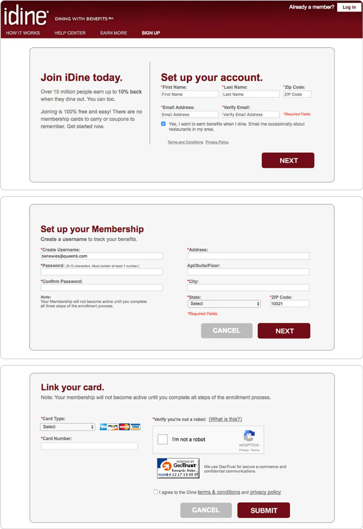
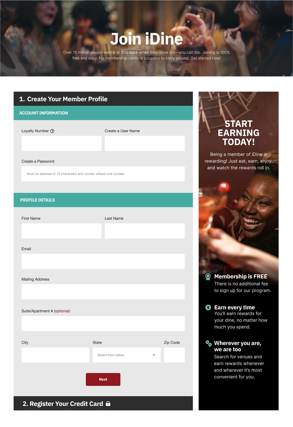
The enrollment process was reduced from three pages to a single page with a simple two-step form. By removing non-essential fields, the flow became faster and less fatiguing. As a result, signups felt effortless, encouraging more users to complete the process.
Now vertically formatted to direct the user flow and focus visitors on a single task at a time. Use of mobile-friendly accordion panels keeps the interface clean, hiding irrelevant information, which enables details to be reviewed/updated without distraction.


Clean and void of unnecessary elements, the newly designed page takes on more of an e-commerce product page feel. Additionally, supplemental editorial content boosts SEO while adding brand personality.


